Plotting pre-post results in R
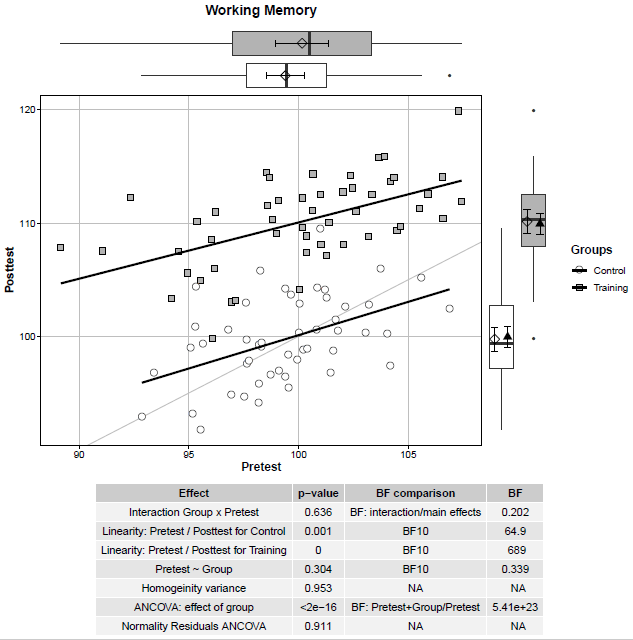
A quick code to create a useful plot to visualise pre- and post-test results. I was inspired by this post , this post , and this post . A scatterplot between pre-test and post-test scores for the control and the training group is presented. The straight black lines represent correlations between pre-test and post-test scores within the two groups. The straight lightgrey line represents the same values at pre-test and post-test –> Subjects above the line display a better performance at post-test compared to pre-test. At the margins, the boxplots are reported as well as the mean (i.e., diamond) and 95% confidence intervals (i.e., error bars). In the case of the post-test scores (plot on the right margin), the adjusted means (i.e., black triangles) and associated 95% confidence intervals (i.e., error bars) are reported. The table reports the results for the ANCOVA and its assumptions. In this example, participants in the training group show an improvement in a Working ...

Comments
Post a Comment